About Me

My photo
Self Portrait: "You are my Dark Clouds" I AM WOMAN HEAR ME ROAR! I am daughter, I am mother, I am friend, I am teacher, I am student, but still I am more. I am loyal, I am kind, I am loving, I am smart, I am funny, I am wise, I am no mans fool...so beware. I am also creative, I am a visual arts student majoring in photography and passionate about anything related to the arts, whether it be performing arts, visual arts or great literaty works. I am passionate about pursuing a cultured life with youthful enthusiasm, that can be shared with good friends and family over a nice meal with a glass of wine. And of course...I like to chat, so please join me here every week to explore lifes little mysteries together.

Thursday 6 December 2012

UniSA 2012 Graduates Exhibition - HUNT

This years Graduates Exhibition for the University of South Australia’s Art, Architecture and Design, is titled Hunt and showcases all of the 2012 Visual Arts graduates final body of work for the Undergraduates Program, Honours Program, along with the Visual Art and Design Graduate Diploma and Masters Program.
The nights ceremony was opened by the lovely Lisa Slade and saw an array of  prizes, scholarships, industry and academic achievement awards being presented. Lisa Slade eloquently discussed the shows title - Hunt, and how it relates to the exhibition and likened the journey through art school to a kind of disconcerting, blind stumble through dark woods with the constant quest that is required during the studying experience to excel. Clearly there is an interplay of the concept of enlightenment between the hunted (the idea) and the hunter (the artist) and how that relates to the passion and drive required to succeed. The hunt also refers to being sought out or pursued by industry professionals.
The exhibition showcased the work of over 100 graduating students across a multiple of disciplines including sculpture, ceramics, glass, jeweler, textiles, drawing, painting, printmaking and photography. It is obvious this exhibition celebrates a diverse group of creative individuals and is a platform many very talented emerging artists, some of whom will undoubtedly go on to be leading industry professionals.
The grad show is an annual event and an amazing opportunity to discover talented, enthusiastic, passionate artists and see what they are producing, whilst being an occasion to acquire some  amazing artworks at an affordable price before these individuals become famous and are sought out by curators or gallery directors. So  if you were unfortunate enough not to be part of last nights celebration where an abundance of good wine and tasty cheese platters were enjoyed, then it is recommended you take the time to head over to UniSA and immerse yourself in a plethora of visual treats and glimpse the next wave of leading visual artists to have emerged. You wont be disappointed. The exhibition will run for a total of ten days until the 13th of Dec 2012 9am – 5pm daily and is accompanied by a unique set of catalogues.
WHAT: Hunt: UniSA Graduates Exhibition
WHERE: SASA Gallery, Kaurna Building, UniSA City Wes
t
Note: This event is entirely funded by students, along with fundraising efforts by the students and with some external grant support. Grant support varies every year depending on competition for each round and the availability of funds. A big shout out to the 2012 Visual Arts Grad Show Committee for coordinating this outstanding event, along with organizing of funding for the catalogue printing, website design and hosting, event marketing and advertising, opening night catering, photographer, bar staff, security, preparation and clean up of the space prior to install and post demount. CHEERS!

WHAT AN AMAZING NIGHT AND OUTSTANDING SUCCESS!

Danae Thyssen

Friday 2 November 2012

2nd November 2012 - Danae Thyssen

Behind Closed Doors” provides a useful reference in terms of genuine insight, as the premise for these works, which are inspired by true stories of domestic violence. The creation of a body of work that retells in visual and verbal language the actual real-life stories and experiences of various women

Graduates Exhibition - This body of work explores the topic of domestic violence, a sensitive and controversial subject. As an artist, I believe it is our role and responsibility to initiate conversations on various topics, to evaluate and challenge societies perceptions. Generally there is a real ignorance around this topic and the facts of what constitutes as abuse. This series combines art with storytelling in what I hope is a visionary, if not controversial approach with a poetic and prophetic response using somewhat sensational imagery.  The intention is to assist the viewer to feel and understand the essence and gravity of the problem of violence against women by looking at the problem with a fresh perspective, creating a new dialogue to help heal and transform through raising awareness.
Artists such as Nan Goldin, Tracey Moffett and Anna Gaskell have been instrumental in the approach for  this work, for fundamentally different reasons. Although inspiration has come from various other sources, it is Goldin and Moffett who in particular provided the initial context for my exploration of   Domestic Violence within art. There is one particular colour photograph of the artist Nan Goldin looking directly at the camera with both eyes swallon and bruised, the left filled with intense red blood in the white of her swollen eye which mirrors the shade of her lipstick. Although she has obviously suffered some kind of physical damage, she appears well groomed with glossy hair, adorned in earrings and necklace. This image marks a particular period in Goldin’s personal life and the conclusion of a long-term relationship, providing an emotional climax. “I want to show exactly what my world looks like, without glamorisation, without glorification. This is not a bleak world but one in which there is an awareness of pain, a quality of introspection' (as quoted by Goldin in The Ballad of Sexual Dependency, p.6).  As I researched Goldin and various works of the artist, it was more specifically the ideals and themes explored  within  many of her work that held a particular interest.

“I often fear that men and women are irrevocably strangers to each other, irreconcilably unsuited, almost as if they were from different planets. But there is an intense need for coupling in spite of it all. Even if relationships are destructive, people cling together. It's a biochemical reaction … love can be an addiction. I have a strong desire to be independent, but at the same time a craving for the intensity that comes from interdependency. The tension this creates seems to be a universal problem: the struggle between autonomy and dependency. The Ballad of Sexual Dependency begins and ends with this premise … I'm trying to figure out what makes coupling so difficult.” (Quoted in The Ballad of Sexual Dependency, p.7.)

Photographer Tracey Moffatt is another artist whose work initially informed the direction I took with the series “Behind Closed Doors” and assisted the context in which my images could be appreciated. It was the skilful and consistent use of text in Moffatt’s Scarred For Life series that held  particular relevance.  Moffat’s use of abrupt captions that  depict and toy with the premise of memories implying traumatic stories that serve to support the images have been of specific interest and has been influential in my initial approach. Moffatt’s dramatic, yet sometimes ambiguous imagery combined with terse and unexpected text create a visually intriguing, but disturbing experience. A supurb example of this is the image ‘Birth Certificate’, where the young girl gazes vacantly from dark shadowed eyes in the direction of the camera, lost in contemplation over something obscure to the viewer with both hands clutching at a piece of paper, its content concealed from view. It is an unsettling image, but the viewer is unsure why until reading the accompanying text, which upon its revelation leaves a terrible sinking feeling in the pit of your stomach.

Intrigued by this effect, I interviewed many women from various backgrounds who had experienced domestic violence and used excepts from these interviews to accompany my images to magnify both the emotional and visual response. Through the use of text, my intention was in part to simply provide information or answers to questions such as “Why do women stay?”whilst at the same time to create a confronting portrait of a victim, which clearly indicates the abuse she has suffered.   The images confront the viewer with the startling reality of what life is like for women in these situations. Unlike Goldin’s approach, my images were presented against a plain black background to emphasise isolation and the depth of the tragedy of DV. However the faces are lit, to indicate hope, a coming out of the darkness by revealing the truth. To create an additional dimension to the works, I ensured that of the many women photographed for both my initial and final series, one in three of them are actual victims of abuse, as in reality the statistic indicated are a fact. However, as in life often society is unaware of who arethe real victims of abuse. 

The works of Artist Anna Gaskell have also been an inspiration for my current series of works.  Gaskell’s work is fascinatingly innocent and disturbing all at the same time. Unlike my own series where I use women from 18 – 44 years of age. Gaskell generally uses all adolescent girls to create a sense of innocence that she then distorts through her use of lighting, framing and subject matter. Gaskell creates these nightmarish scenarios with the use of visual distortion and casting. The young adolescences are specifically costumed and positioned in curiously macabre, somehow sadistic poses creating a discomfort regarding feminine agency and sexuality, along with the unthinkable taboo of corrupted innocence which inturn generates feelings of tension and anxiety. All elements that have inspired my approach.
I was also intrigued by Gaskell’s interest in probing into scenarios and questioning those moments in-between the narratives, when the characters begin to understand that things might not be what they first appear and the happy-ever-after may not be inevitable as first anticipated. After all, not all dangers will be overcome and not all injustices can be set right. In real life, the endings are not always happy.
As my own work has progressed, I have become interested that Gaskell does not represent her subjects as individuals, but more so as generic characters to epitomize the anxieties of all adolescent girls and exploit the contradictions and desires of a single psyche.
Whilst maintaining the same subject matter and medium with which I began this series, the final artworks for this assignment have taken quite a different direction to where I had initially intended.  After some consideration, I decided to take a more ambiguous approach that would draw the viewer in before the startling reality of the underlying concept becomes apparent. Once they are already engaged with the image making it harder to look away regardless of how uncomfortable the topic. Initially I advanced along the same vein as Goldin and had a far more documentary approach, but with the added narrative, that was fondly used by Moffatt in the Scarred For Life series. As I experimented throughout the process, I found I was more interested in hinting at the prospect of abuse, rather than documenting it.
Although my initial images were successful and received very positive feedback, I felt that because of their blatant approach they could be somewhat alienating to the viewer because they were so confronting and the sad truth is often the public does not want to know. The idea of violence being less obvious and more of a vague suggestion encourages the viewer of their own accord, to look more closely. Inspired by the hint of something more sinister, but delivered with ambiguity as demonstrated by artists such as Gaskell, I have experimented more freely with what I would include in the frame. Gaskell, has clearly verified that what is included within the frame is as important as what is eliminated from the image. The absence of detail can disclose as much as what is included.  Just as Gaskells use of body parts is employed to communicate a sense of subjugation and psychological disconnection, so too was the intention of my approach, by eliminating the identity of the individual photographed and by featuring repeated portions of the body in similar poses by each woman.  My images do not represent the individuals photographed, but function as a means to convey the challenge and conflict of a solitary experience that through being witnessed becomes a shared awareness.
This psychologically loaded subject matter presents aesthetically beautiful images of vulnerable women illuminated by soft natural lighting which softens the harsh reality where the psyche is in question, or has been splintered and oppressed by perverse acts of violence. The delicate flesh of various women photographed are draped in soft, sheer, flimsy fabrics that draw the viewer in, enticing them with an elusive invitation to gaze upon their seemingly perfect flesh until it is interrupted by something darker, ominous, disturbing . Only as the viewer allows their gaze to linger and looks more closely do they notice that something is amiss. The vulnerable figures and their soft, feminine curves are marked in some way with hints of redness, subtle bruising or scarring that whispers of something more sinister. The images have been photographed against a muted pastel blue background, to enhance the soft velvety texture of the skin and enhance the delicate nature of the figures. There has been attention to the form and use of negative space which further add a sensual, intimate allure to encourage and draw the gaze to the image.

The photographs are not tied together in any linear sense; moreover as though the unsettling events have all take place simultaneously, in the ever-present. Therefore the ‘before’ and ‘after’ within each image is eliminated, allowing potential interpretations to multiply. The tantalizing images clearly have voyeuristic elements that tempt the viewer to remain engaged with the subject rather than turning a blind eye as would usually be the case in situations of abuse because individuals don’t usually want to become involved. In this scenario the viewer has become part of the experience and can no longer fain ignorance. This approach to the subject also serves to extend awareness of how these women have been drawn into these relationships. Just as the viewer has been visually seduced, so too are women in abusive relationships, lured by the charm of the perpetrator and promises of something more, the fairytale.

My intension was to focus on the interplay between fantasy and reality to expose the ugliness and the harsh truth that sometimes intimate relationships are not all they appear to be, if we are willing to scratch the surface. By raising awareness of the complexities within these types of dynamics, then possibly the shame that keeps woman silent or trapped in abusive relationships can be eradicated in order to encourage women to speak out and become empowered. It is my hope that upon viewing my final series that the audience leaves the exhibition with a greater empathy and heightened understanding of the complexity of abusive relationships. Then in turn, provoke thought, raise questions and forge conversations through a new found awareness to promote social change.


25th October 2012 - Esther Barend

In 1964, Barend was born in the Netherlands to an artistic family. Upon completing her studies, she lived and worked both in Paris and Amsterdam before establishing herself as a jewellery designer. Several years later, Barend undertook classes in Arendonk at the Academy of Fine Arts in Belgium. Throughout the years, she developed her own unique style, but continues to seek ways to surpass herself, develop further by constantly experimenting and challenging herself to discover new horizons. Barend now works and lives in Belgium with her work being exhibited from New York - Amsterdam - Paris to Tokyo. Esther Barend has a relentless desire to paint and has found it an essential to the way she lives, as it is her way of openly expressing herself with total freedom using paint on canvas in poweful, vigorous motions when there are no words. The image is built up with intense, contrasting, vibrant colours, along with a multitude of layers that transport the viewer into another world through a captivating visual spectacle, which exists only in our own mind.  Barend is very much inspired by her rich and complex inner world and explores its entirety through an inevitable personal perspective as an artist which is magnified by her present flow of emotions and contemporary events. There are those who question if Barends figurative abstract artworks are inspired by masks of the carnival, when in fact the works are based more on the premise of the general masks that we all unconsciously wear on a daily basis to disguise our emotions or hide our insecurities. Barends intension is to display on the outside, what is on the inside through a multitude of complex layers and details in the hopes that by revealing the truth we can be strengthened or softened depending on which emotions need to be adjusted by the thoughts we keep hidden internally. The beautifully intricate paintings encourage us to open our minds and look beyond our initial and sometimes limiting sight in order to develop a manner of seeing that shifts our understanding.
Artist and Studio
The Fine Art Nude

Come with me, 50x60 cm | 20x24 inch, acrylic on canvas

“Different Points of View” by Esther Barend

17th October 2012 - Vernon Ah Kee

Vernon Ah Kee is clearly one of Australia’s most political Aboriginal artists of the 21st century, who makes up part of the Proppa-now initiative which formed in early 2000 fighting against oppression and racism with outspoken confronting artworks. Ah Kee was born in the North of Queensland and is of the Gugu Yimithirr, Kuku Yalandji, Waanji, and Yidindji tribes, but has now lived in Brisbane for the last 12 years. Ah Kee has forged a name for himself with his large charcoal portraits that pay homage to the past, along with bold text-based artworks advertising mottos, which aim to challenge the definitions of what constitutes as Aboriginal identity. The premise for these works began during Ah Kee’s time as a student when he was studying at the Queensland College of Art until in 1991 when he dropped out after the death of his maternal grandfather with whom he was very close. During the time when Ah Kee was not in University he was employed as a screen printer for various T-shirt companies where he worked several stints before he returned to complete art school. Eventually when Ah Kee was in his late twenties he returned to art school at Griffith University in Brisbane where he completed a Bachelor of Visual Arts, majoring in drawing and screen-printing, along with an honours degree. Additionally, Ah Kee went on to complete his Doctorate of Visual Arts at the Queensland College of Art whilst sidelining as an Associate Lecturer for five years.   

During Ah Kee’s time at the University of Queensland was when his interest in typography was first piqued with text-driven works by artists such as; the revolutionary feminist Guerilla Girls and American artist Barbara Krueger. It was in the course of Ah Kee’s third year at art school that he held his debut show titled “If I Was White” at Metro Arts, which was reviewed by fellow art student John Milani who chose to review it the exhibition as a component of his assessment . Consequently when Milani went to work at the exceptionally influential commercial gallery in Brisbane managed by Peter Bellas, he signed Ah Kee after discussing it with Bellas. Together they decided to represent Ah Kee with his exhibition “If I Was White, in 2002 which sold to the National Gallery Of Australia and the National Gallery Of Victoria.  Bellas has since retired, handing the gallery over to Milani who has continued to be Ah Kee's dealer and with whom he has developed a close friendship. Milani now also represents Ah Kee’s Proppa Now associate, the colourful and forthright Richard Bell.

Ah Kee’s work is predominantly a critical evaluation of popular culture here in Australia. More specifically it is a platform for the black/white discourse which is explored with biting and pithy dialogue delivered through bold black text that runs together on a white canvas outlining the dichotomy between black and white Australian cultures. Throughout the years Ah Kee has refined text as the primary visual component with provocative themes that are hard hitting, sometimes terse, yet profoundly beautiful and poetic, at times even humorous.  However, it is easy to understand how at times the provocative themes he undertakes could fail to reach their target audience and may cause reactions of anger rather than responses of unity and understanding Ah Kee will render no apology for his condemnation of an industry he holds responsible for fabricating, then perpetuating, a misleading and marginally defined identity for Aboriginal people or for offending many Aboriginal art curators in the process. Ah Kee is quoted as saying;
My work is not always about sending out a message, but if it needs to be made, then you have to make sure that message is clear…The problem with art produced and retailed through art centres, if you want to call it art, is that the artists don't understand their role. I'm talking about the narrow definition of Aboriginal art that the people in remote communities live up to, to their own detriment…It's important for Aboriginal artists to understand that art in Western culture is a commodity, and the art market an industry that runs like a well-oiled machine. The artist's role is to work within that system to create exceptional art.
 

Ah Kee’s concern is that many Aboriginal communities are in upheaval, rife with illness and poverty stricken. Yet, when we assess the art that continues to emerge from those indigenous regions to be exhibited in the galleries of Sydney and Melbourne we are led to believe the artist’s lives are ideal. One of Ah Kee’s main concerns is that there seems to be no real accurate criticism when it comes to Aboriginal art and the mythology he considers surrounds it. He believes that there are far too many people who seem to want to succumb to ‘that romantic ideal, that identity, that aesthetic’.  In Ah Kee’s opinion, Aboriginal art ought to be as diverse as the Indigenous people within our communities.  Ah Kee states,
 My work is about my life now," he says. "I use my own family to demonstrate the depth and complexity of modern Aboriginal life. I'm expanding the idea of what it means to be Aboriginal and what it means to be human. A lot of the problem this country has with Aboriginal people is that it struggles to see Aboriginal people as fully human.
Yet, Ah Kee believes his Aboriginal heritage, is not an issue and bears no weight or significance for a critical appreciation of his work. Although he has expressed a curiosity as to his Chinese heritage, which is the origin of his surname and the legacy of his paternal great-grandfather. Ah Kee has questioned if there is indeed anything in his make-up that might give an indication to that side of his family’s history of which he knows very little.  
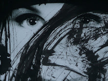
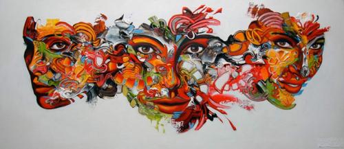
Although Ah Kee initially had no intention to dedicate his days to art, he has always had a natural talent and been fixated on the process of drawing, which was influenced and developed due to his love of comic books. Aside from his text inspired works, Ah Kee is renown for his abundent charcoal and pastel drawings on canvas of family members which were created to provide some insight into the past of his ancestors and of Indigenous life in Queensland. To a large extent the original source material from which Ah Kee’s portraits were inspired, evolved from a whole series of drawings that are in essence archival images of his great-grandparents and his grandfather from Palm Island who were shot in 1938. Ah Kee describes how the photographs were essentially a collection of scientific records from anthropologist Norman Tinsdale who went around Australia to Aboriginal communities throughout the 1920s to the 1960s, documenting and giving classifications to a dying species. Although well intentioned, Tinsdale identified this exotic 'other' by labelling them with serial numbers, rather than by name, which only served to further alienate those who already been pushed to the side and forced to live in Aboriginal reserves and missions in a kind desperate sub-human existence. Upon looking at Ah Kee’s drawings it would seem that his images are a direct response to the past of romanticized and exotic portraits of ‘primitives’ that are secured in scientific records and museums, which have been translated to a modern people occupying  current spaces and real time.
Ah Kee’s drawings undoubtedly inhabit the space with an undeniable human presence and more so, as a stand from those of indigenous backgrounds. The focus of each subject in these oversized portraits is their ‘gaze’ which leaves the viewer with a real sense of discomfort, as though they are being confronted by the act of the stare and having to look into the face of an accuser. Although for Ah Kee there is comfort in the eyes of his family staring back at him and being surrounded by the familiar. Ah Kee is quoted as saying,
"But what was particular about the images to me was the gaze, this very intense gaze, and profoundly affected me. So what I'm doing is I'm representing those images and trying to retain the gaze, cos it was a gaze of endurance and persistence and intelligence and emotion and depth. And a kind of deep-thinking and hunger that is not normally associated with black people. I'm trying to establish an idea of Aboriginal that is contemporary and modern and stripped of all the romantic ideas around spirituality and virtue and the decorative Stone Age. So, I'm trying to demonstrate that Aboriginal art is more than what we think it is and that Aboriginal people, as a subject, is more than what we think it is. And, even more than that, it's a beautiful thing." 

Apparently it is not unusual for the artist to turn out the lights in his studio at times and just sit in silence among the various portraits he is working on and with which he finds solace. Currently Ah Kee has created well over 40 family portraits and anticipates he will complete up to 100. Ah Kee was especially pleased with those of his portraits which were exhibited at the Sydney Biennale in 2009 because of the way in which the so compellingly confronted the viewer with the subjects' gaze. Ah kee was also one of  a select group of Australians chosen to display his works at the Venice Biennale being the most significant visual arts stage in the world.  Additionally he had 12 of his artworks on display at Sydney's Cockatoo Island as a component of the biennale, along with three of his large charcoal portraits which hang in the Queensland Gallery of Modern Art. Due to the high standard of Ah Kee's portraites and obvious drawing skills, not to mention his international acclaim, Ah Kee receives many requests to create commissioned portraits of which he is not expecially interested. Even when the National Portrait Gallery enquired as to whether he would be prepared to create a portrait of Aboriginal leader Noel Pearson, he declined due to the fact that he does not respect the politics of Pearson enough.

In addition to being a portraitist and graphic artist Ah Kee has now added another medium to his practice being the video for the Cant Chant exhibition where Ah Kee seizes the iconic subject matter of the beach and assesses it with a critical point of view  on its formative role in developing the Australian identity. This series of work casts aside the typical recognised ideal of the beach as being a environment associated with fun, relaxation and leisure and instead introduce it as a cultural battleground. The Cant Chant video features a young Aboriginal man who emerges as a new-age warrior, surfing the waves of North Queensland on a board painted with the bright markings from the rainforests shield designs of that region. For all intensive purposes the board almost appears to be transformed into a weapon, whilst other water – logged surfboards are featured floating dead upon the water after having been blasted by guns. 


12th October 2012 - Anna Gaskell

The works of Artist Anna Gaskell have also been an inspiration for my current series of works.  Gaskell’s work is fascinatingly innocent and disturbing all at the same time. Unlike my own series where I use women from 18 – 44 years of age, Gaskell generally uses all adolescent girls to create a sense of innocence that she then distorts through her use of lighting, framing and subject matter. Gaskell creates these nightmarish scenarios with the use of visual distortion and casting. The young adolescences are specifically costumed and positioned in curiously macabre, somehow sadistic poses creating a discomfort regarding feminine agency and sexuality, along with the unthinkable taboo of corrupted innocence which inturn generates feelings of tension and anxiety. The elaborately staged photographs, extreme cropping, creative angles are cinematically lit giving the impression of the adventures of Alice in wonderland being filmed through the lens of an Alfred Hitchcock film. This is further magnified by the cartoonish saturation of colour, re-enforcing the discomfort the viewer experiences as they observe the characters cruel and peculiar actions. The juxtaposition is that whilst the images mesmerise with the romanticized, stylized doll-like manner in which they are presented, the obvious fetishization and sexualization of their isolated legs and feet, leaves one with feelings of revulsion at the possible undertones of violence. The general impression is disconcerting in a way that cannot be initially
conceived.
Untitled #23, from the Override Series
Gaskell’s creates intensely psychological photographic works fraught with a definite unease and are a personal exploration of the narratives enveloping the literary adventures of adolescent girls who alternate between victim and aggressor in an effort to overcome all the perils and injustices they encounter.  Gaskell is interested in probing into scenarios and questioning those moments in-between the narratives, when the characters begin to understand that things might not be what they first appear and the happy-ever-after may not be inevitable as first anticipated. After all, not all dangers will be overcome and not all injustices can be set right. In real life, the endings are not always happy. Gaskell does not represent her subjects as individuals, but more so as generic characters to epitomize the anxieties of all adolescent girls and exploit the contradictions and desires of a single psyche. While unity of these characters is implied by their identical clothing, the strange and often malicious rituals they perform against each other may in fact be metaphors for disorientation and mental illness.
Generally the subjects are dressed alike to further enforce a theme that emphasizes the generic characteristic of the subjects, in addition to embracing an ambiguous element and the indefinite nature of the vague threat. Often there is no obvious threat, no notable danger or something that is overtly sinister, but there is always something that produces feelings of unease for the viewer that they often don’t understand due to an underlying dynamic creating a sense of anxiety. The highly staged images are obviously not a true reality, but are representation of reality that convey an mysterious urgency, magnified by the lack of content which ignites an urgent need for more information, yet denies this privilege at the same time.

For many individuals, experiencing adolescence was a personal nightmare, which left them feeling isolated and alone. Obviously and experience that could be magnified by the unfortunate tragedy of losing both parents during these tender years, as was the case with Gaskell.  Ironically, the approximate generic age of most of the subjects in Gaskells photographs was twelve years old…the age she was when losing her mother, which was followed a few years later by her father. Whilst this is not essential knowledge in understanding or appreciating Gaskell’s images, it does add another interesting layer of meaning to the photographs.  
Untitled #1,  from the Override Series


9th October 2012 - Marc Bowden

Mark Bowden - Snapped SALA

(ur)banality


4th October 2012 - Meg Cowell

Meg Cowell’s artworks centre on the process of collecting and archiving discarded fabrics which she has found, usually in the form of bras and undergarments and then produces images representing feminine identity. Cowell has discovered that Adelaide, the city where she resides has proven to be a fertile hunting ground for such items.
“You would be amazed at what is discarded in the city on the weekend after a big party night. I find all sorts of things in trees, gutters and bins,” she says. 
Upon locating these items, Cowell breaths fresh life into these discarded objects and gives them a new-found identity to create remarkable images. Cowell’s description for her approach to the For Sacrum series was to arrange translucent fabrics onto a light box to generate the images out of a synthesis of digital applications and photography. Her single-minded focus for that series was to achieve balance, connection and symmetry. However, with her more recent body of work, To the Surface Part I and Part II, Cowell has dyed the items and then immersed them in water, individually photographing them. Cowell exhibited images from To the Surface Part I and Part II at AP Bond earlier this year and claims it is her greatest achievement thus far.  
“Getting a commercial gallery to exhibit my work is so exciting. Being able to count myself among really top Adelaide artists and be able to work and make a living as an artist is amazing.”
Approximately half of the images exhibited were smaller works that made use of found undergarments which explore the premise of feminine identity with the bras and underwear. The remaining were larger works  that featured theatre costumes, couture and wedding dresses which Cowell described as a ‘literal up-scaling’ where she explains a garment such as a wedding dress  symbolizes transition – stepping across the threshold.” Cowell’s inspiration and intention for her work is to delve into the concept of feminine identity and take a fresh approach where the foundations are rehashed and reworked. She finds inspiration from such artists as Deborah Paauwe with whom Cowell was fortunate enough to be paired through the mentorship program during her post-graduate work at the University of South Australia.
Cowell claims that growing up in Tasmania has also influenced her work as much of her images are influenced by elements of Tasmanian Gothic  which is a sub-genre born out of  its convict history. Artists such as Anne Macdonald photographs of funeral flowers against black backgrounds and their homage to the Vanities of the 17th century are a definite inspiration. A further motivation for Cowell is the prospect of travelling overseas to the ‘centre of couture’ if she can secure the Australia Council residency in Paris. For Cowell this would be a dream as she can barely begin to imagine the fabrics she might find on the streets of Paris.